My Role
Mobile App Design, UI/UX Design
Tools
Figma, Adobe Photoshop, ProtoPie
About Project
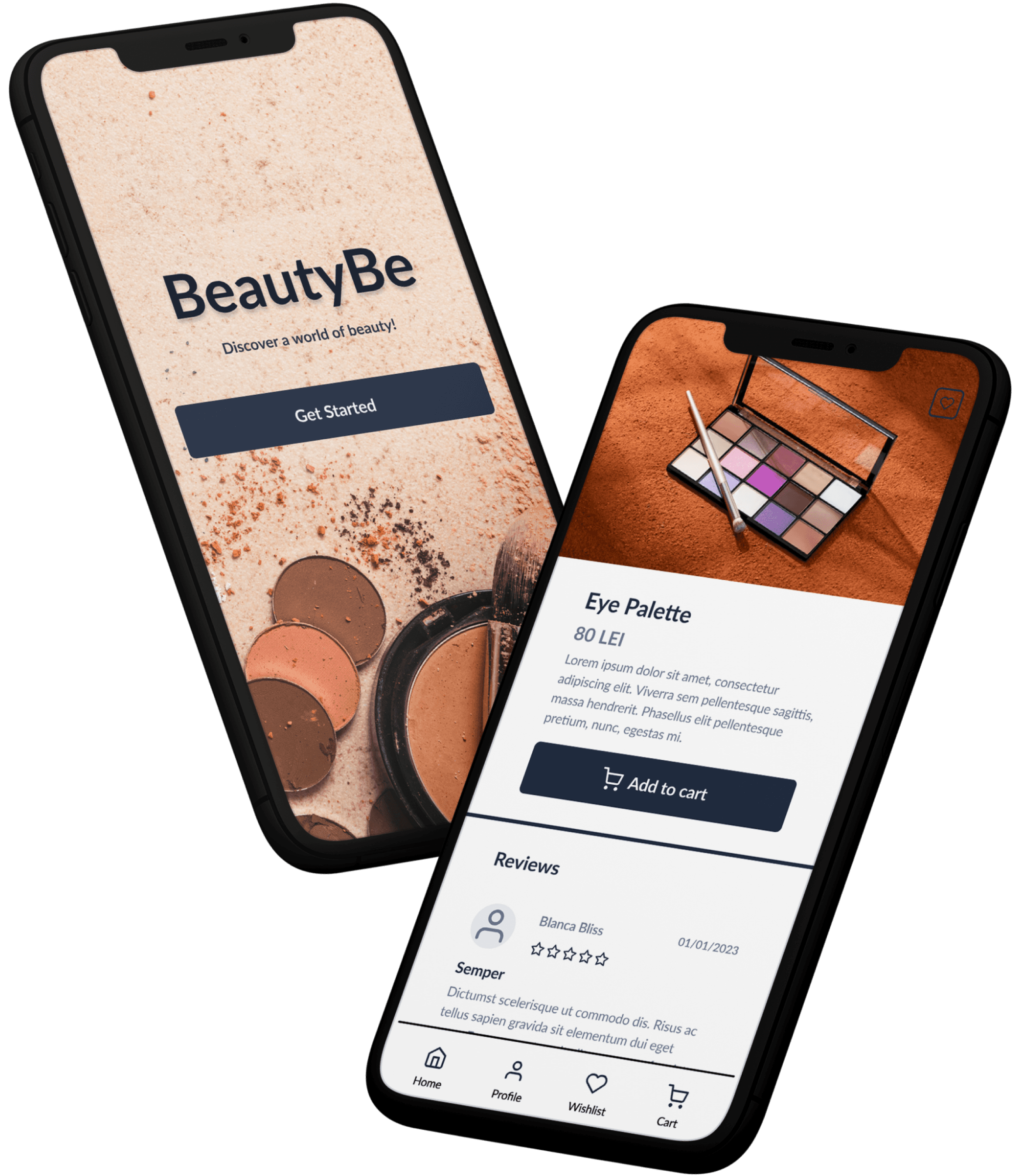
The design project for BeautyBe app is focused on creating a user-friendly and visually appealing platform that provides an intuitive shopping experience. The app has been designed to target makeup enthusiasts who prefer to purchase their cosmetics products online.
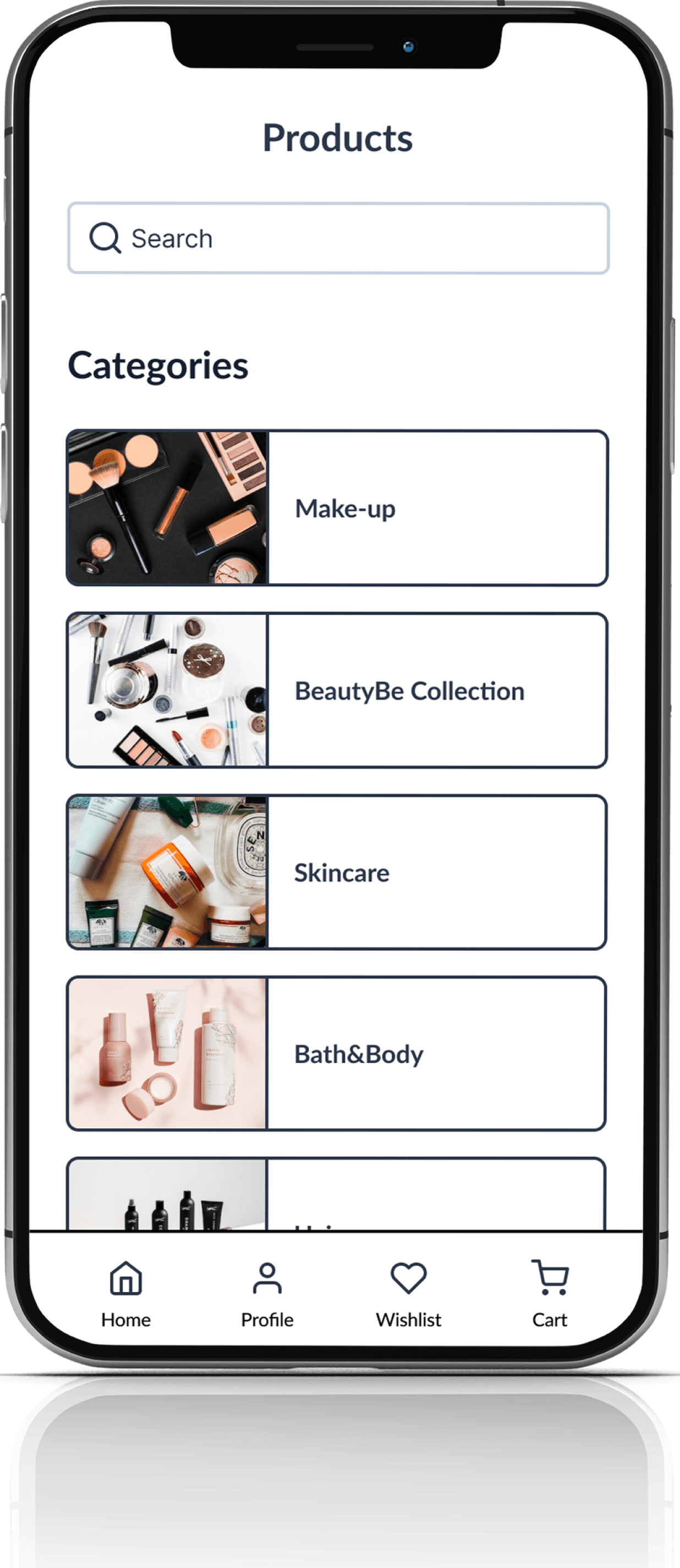
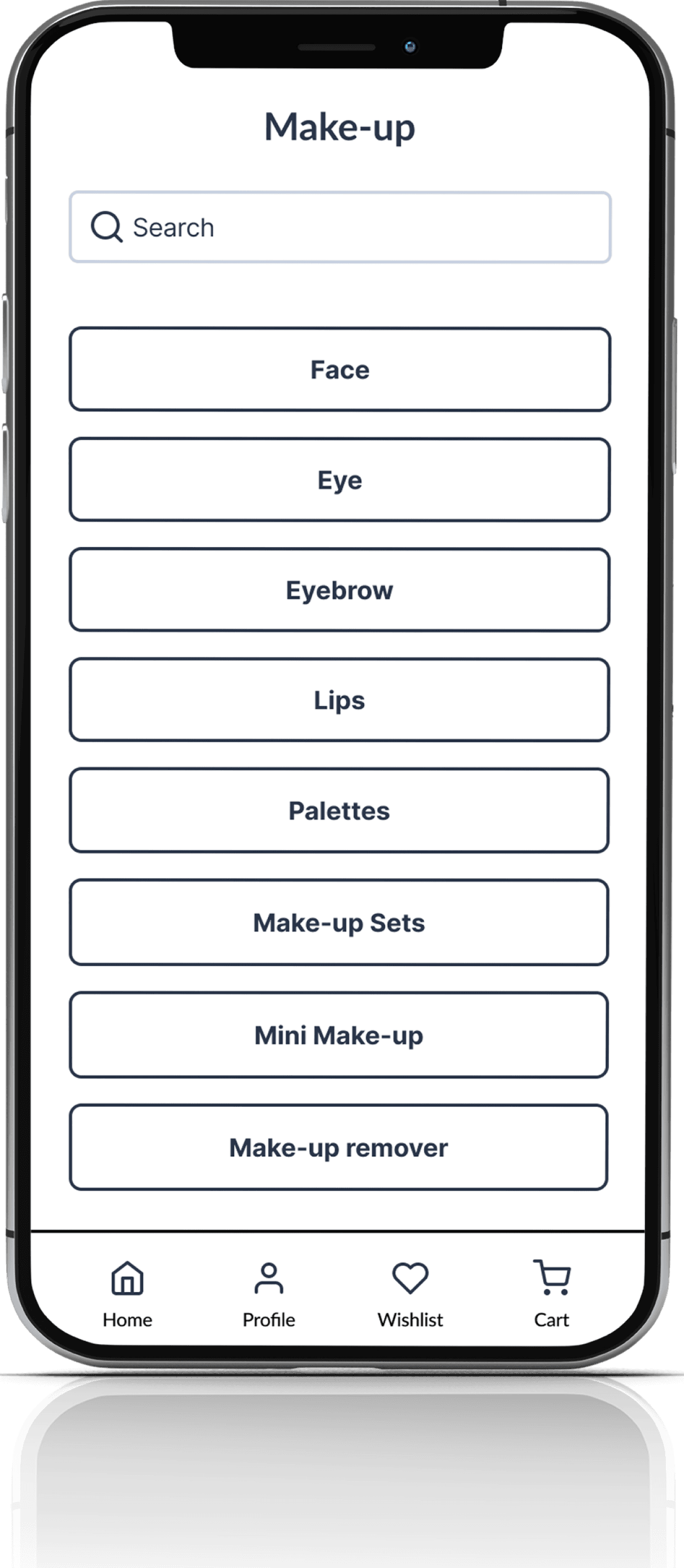
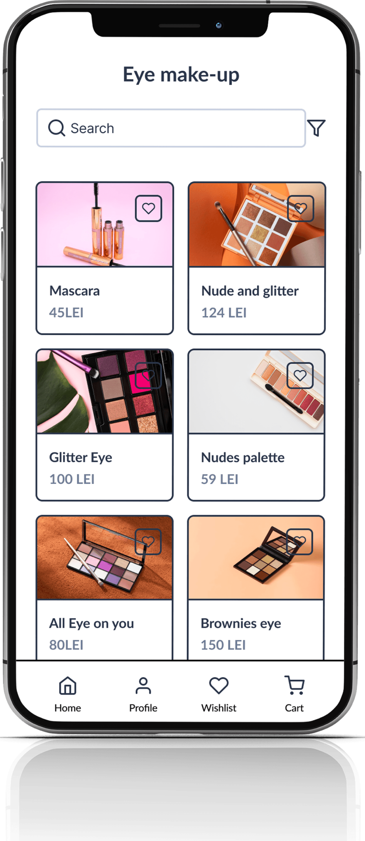
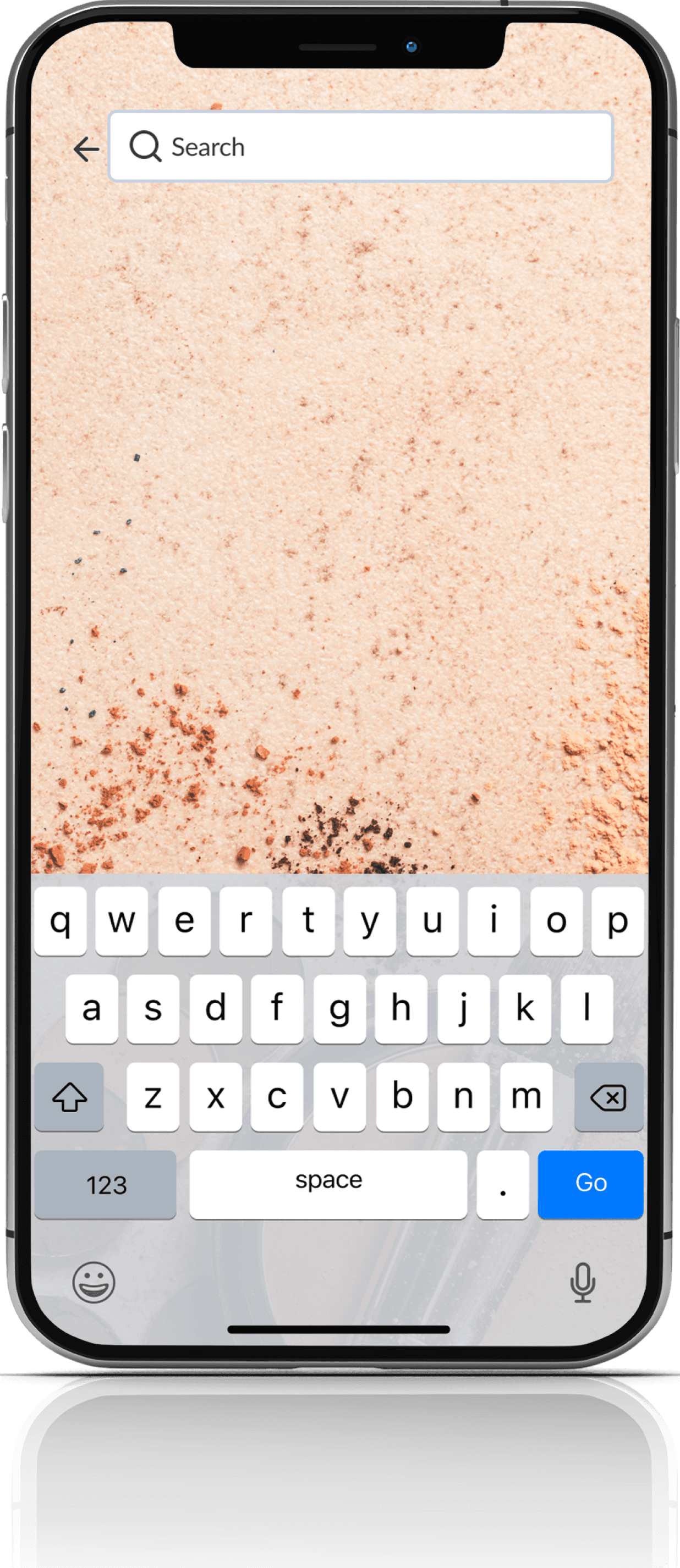
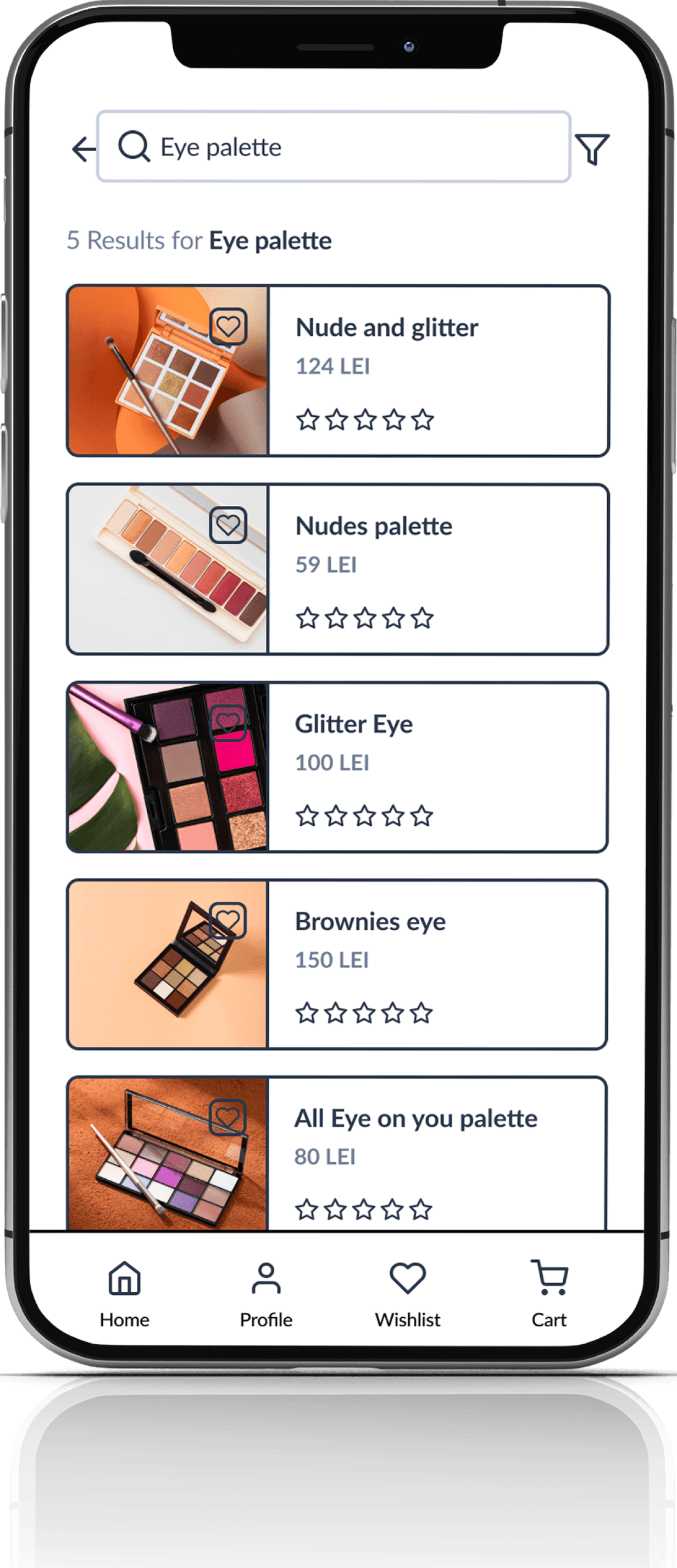
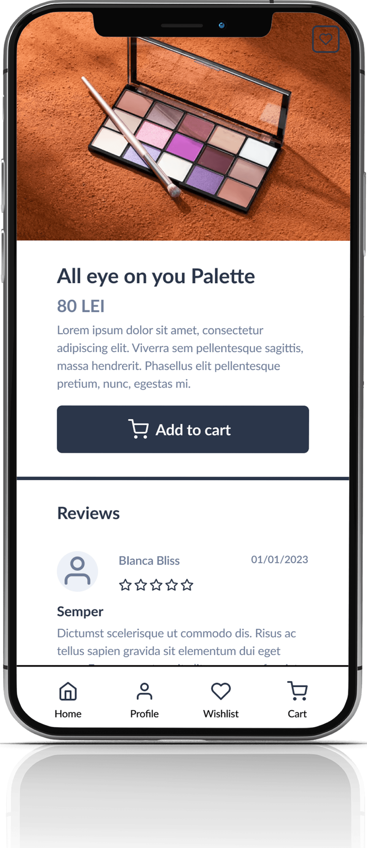
The design of the app focuses on creating an inviting and engaging interface that promotes ease of use. The app has been designed using a modern and minimalistic approach, with a clean layout and intuitive navigation that allows users to browse through different categories and brands of makeup products. Users can also search for specific products using the search bar feature. The app offers product descriptions, reviews, and ratings to help users make informed purchasing decisions.
User Stories
Through crafting user stories, I gained a keen understanding of the features that truly matter to our users, enabling me to empathize with their needs and desires. By organizing these user stories according to priority, I was able to create a product that would not only appeal to early adopters, but also had a solid foundation for success. The end result was a viable product that fulfilled the needs of our users and set us up for future growth.
As a user I want to
Must have
Nice to have
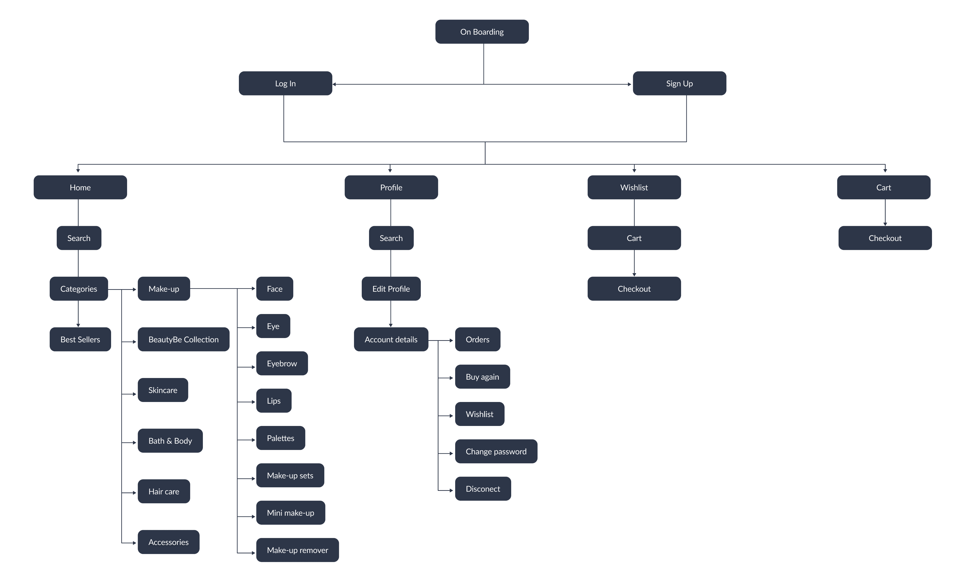
Site Mapping
Wireframes
Wireframes provide a clear visual representation of the app's structure and layout, allowing to experiment with different ideas and make informed decisions about the user experience.
By creating the wireframes, I was able to map out the various screens and features of the app, including the navigation, user interface, and content placement. This allowed me to test different design ideas and make changes before committing to a final design.
Style Guide
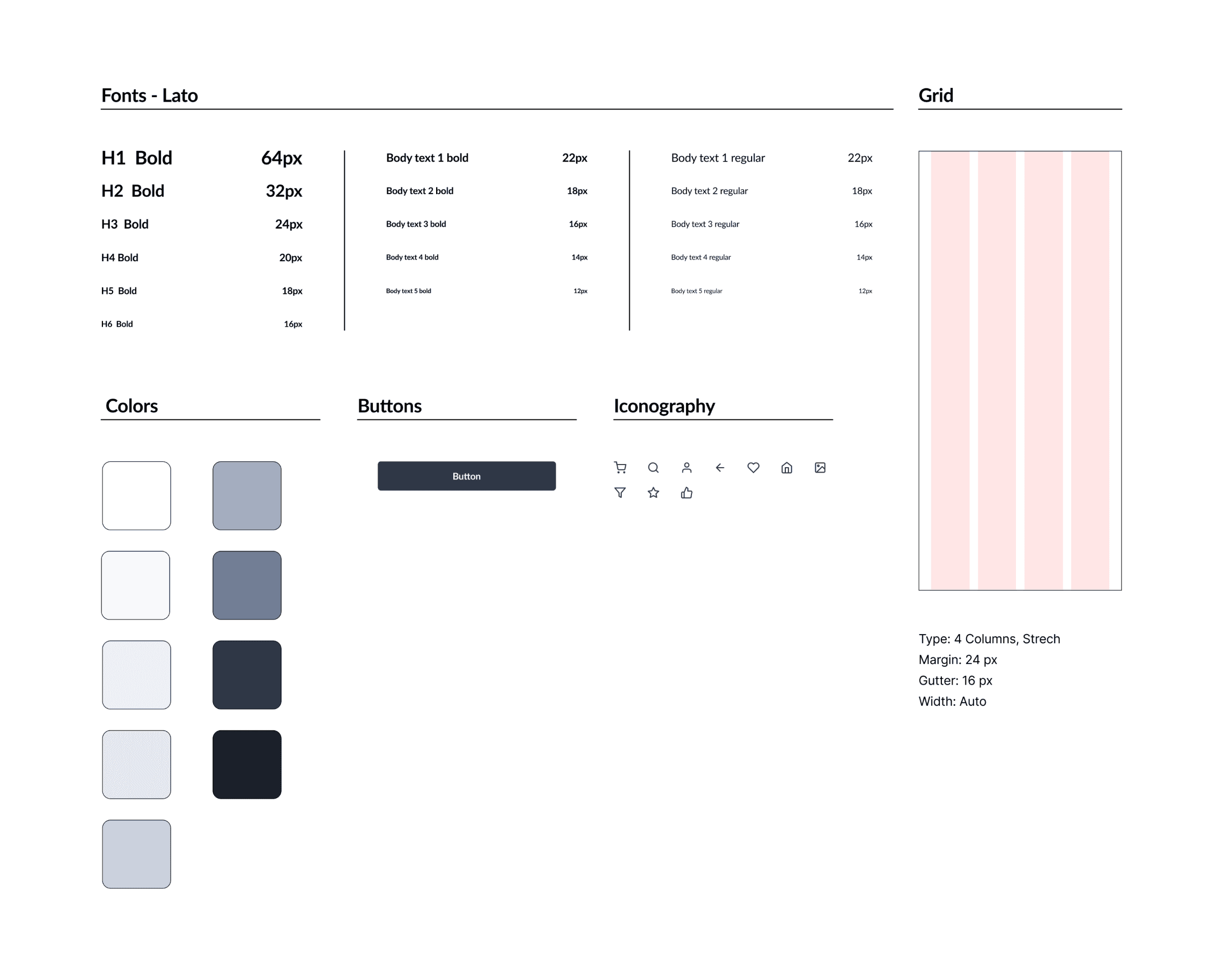
For the style guide, my goal was to create a minimalistic aesthetic that would feature a color scheme with a clean, cohesive look. To achieve this, I selected a navy blue hue to emphasize the brand's established attributes, which I paired with soft shades of grey for a subtle contrast.
To ensure legibility and maintain the overall clean look of the design, I chose Lato as the primary font. This font has a modern, sans-serif style that is highly legible and pairs well with the minimalist design. The result is a style guide that is visually appealing, easy to read, and perfectly aligned with the brand's values and identity.
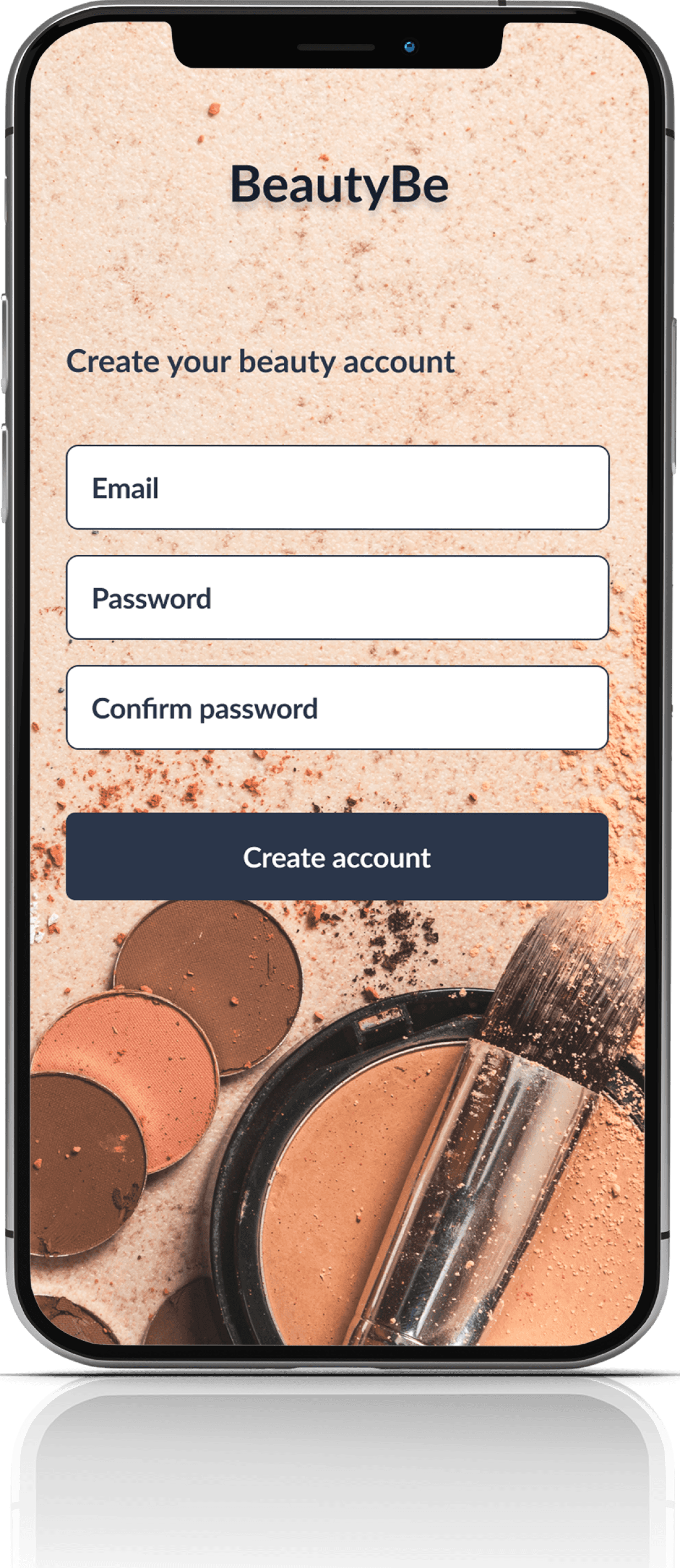
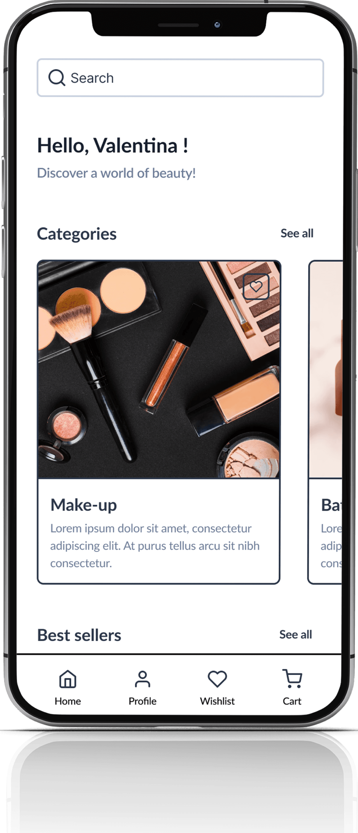
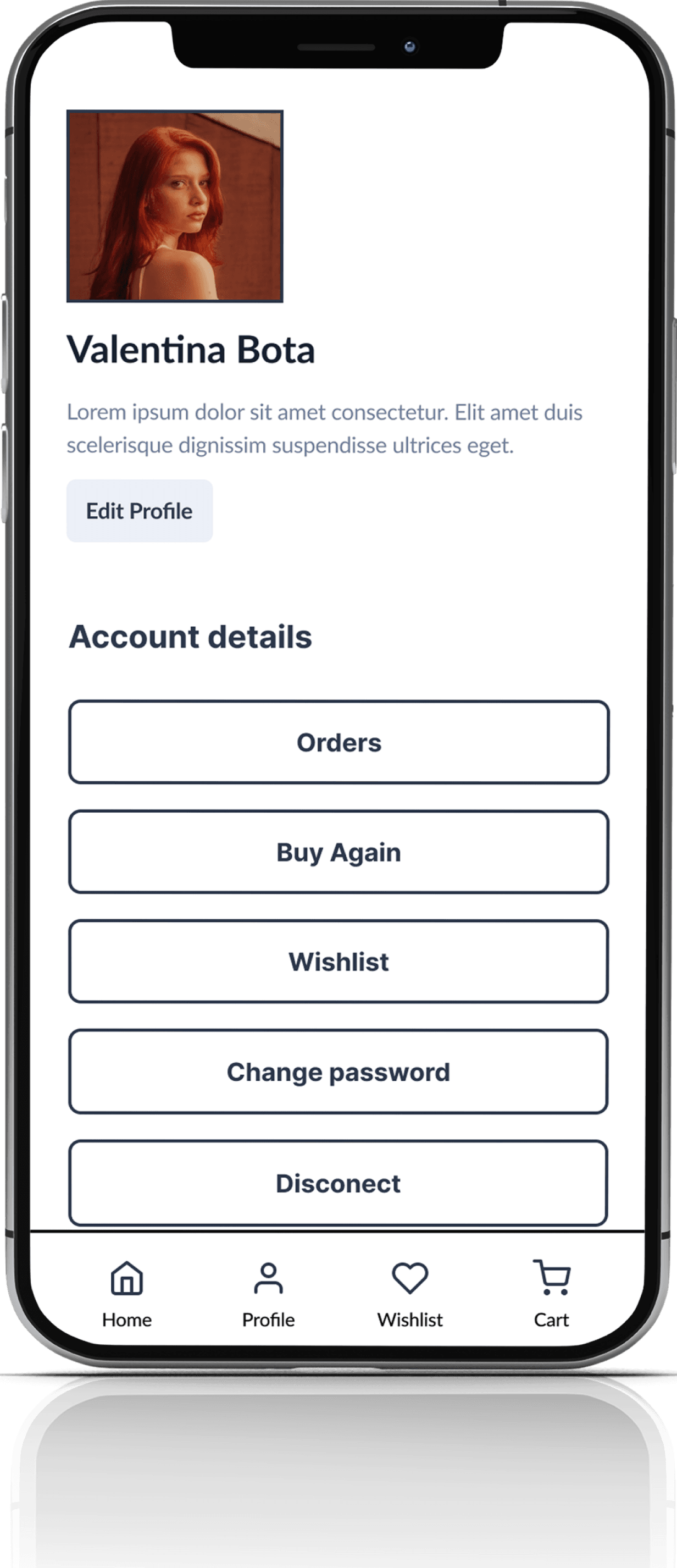
Hight Fidelity Screens
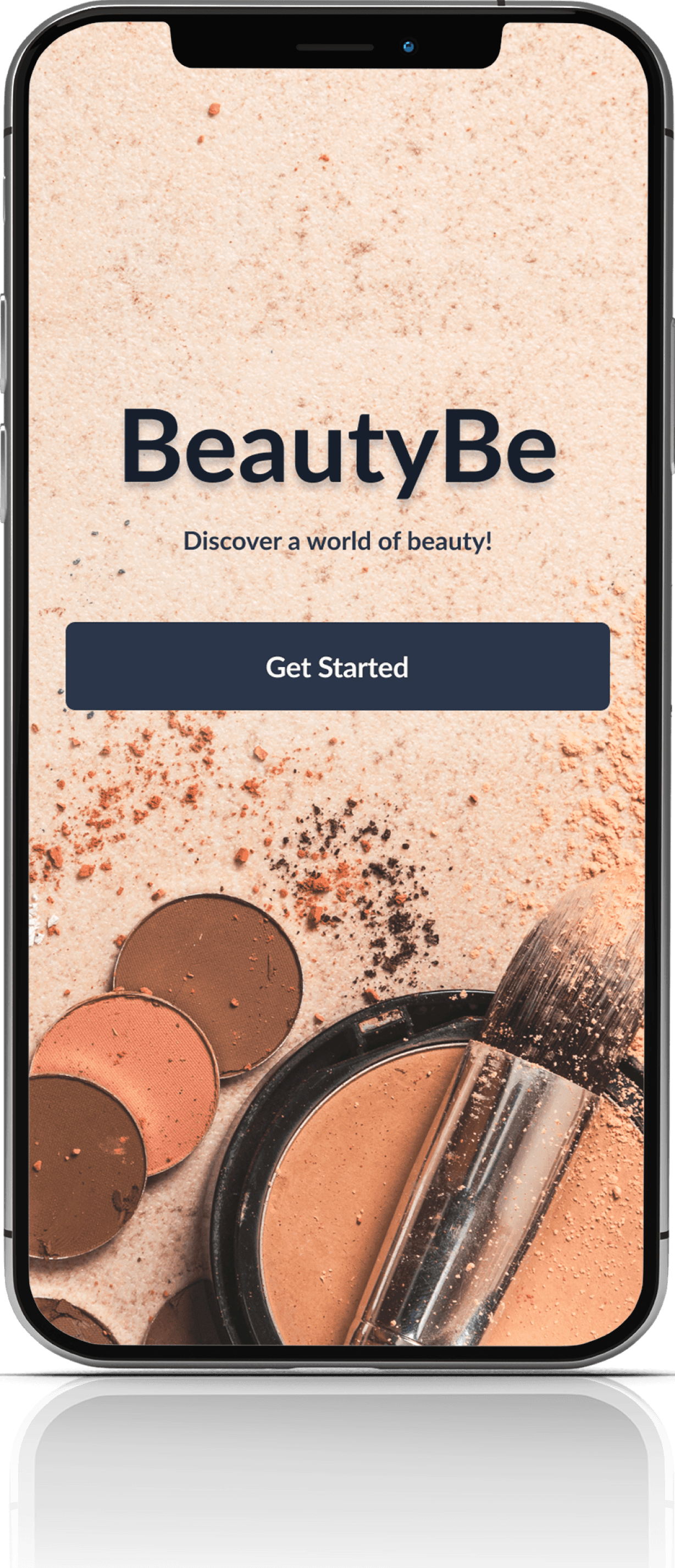
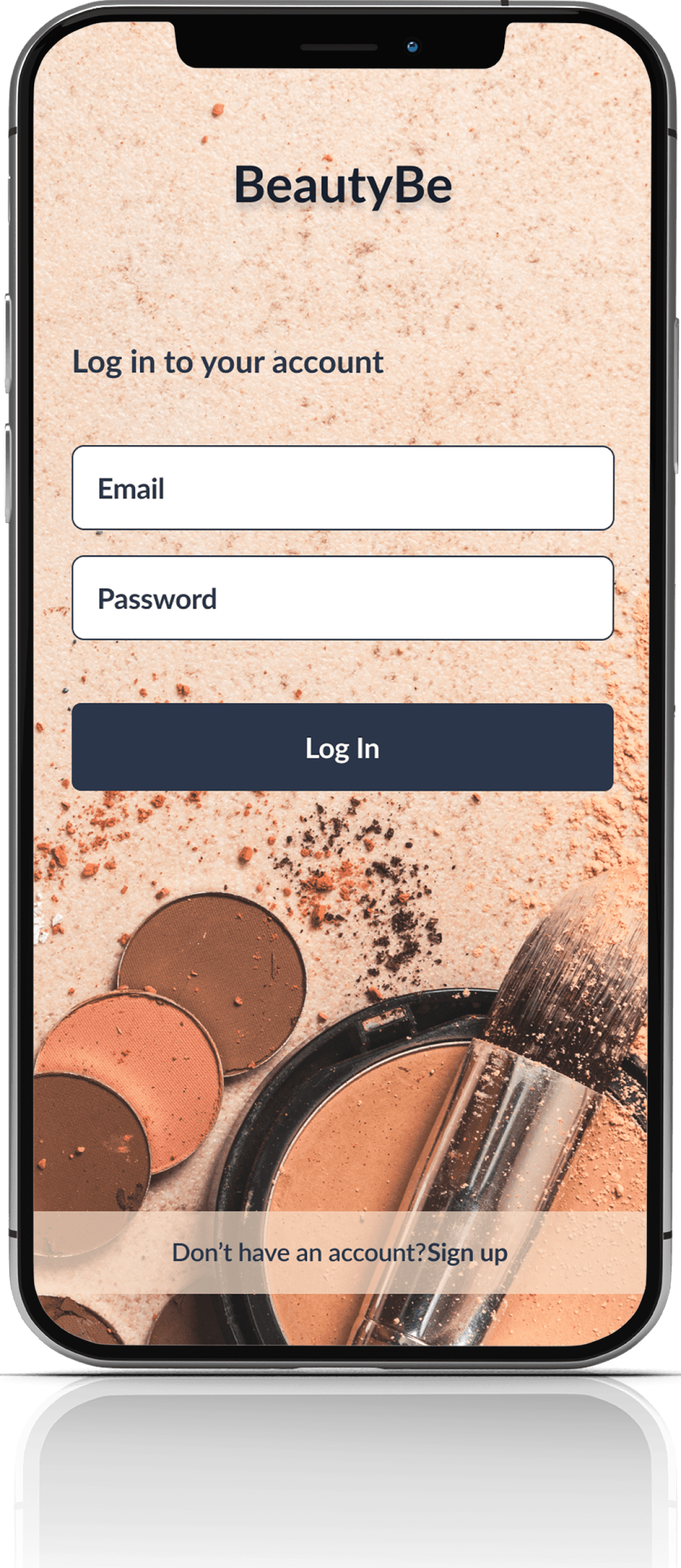
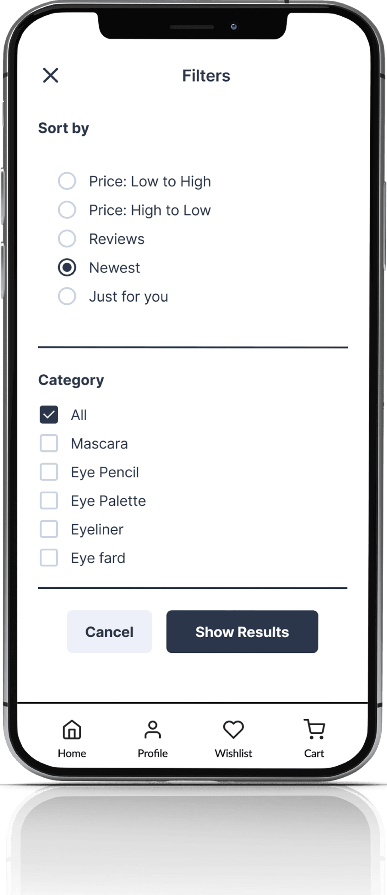
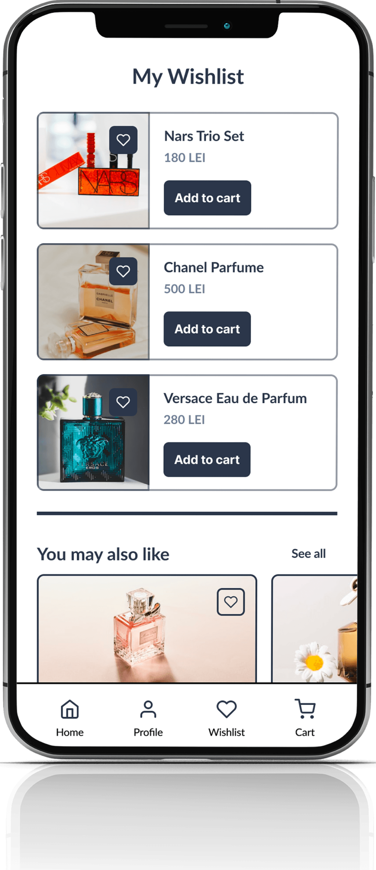
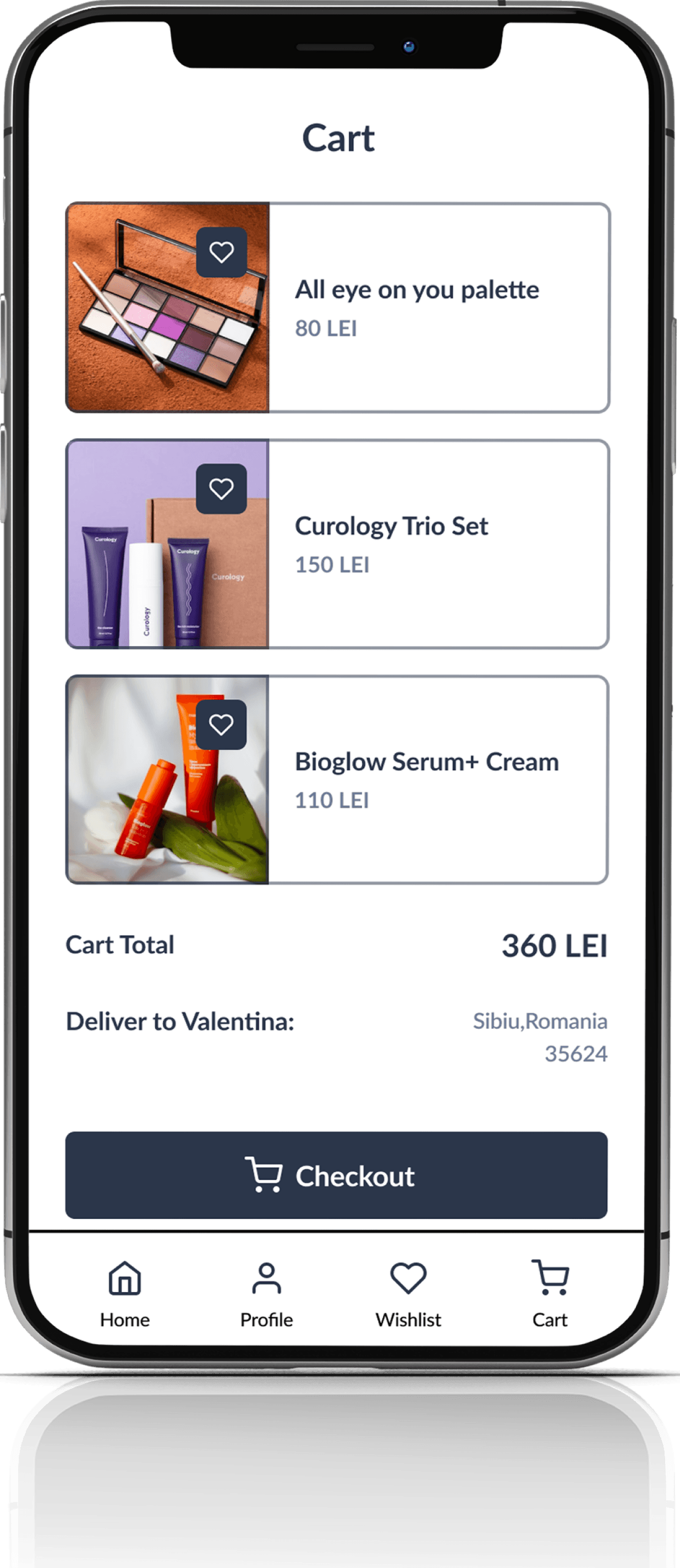
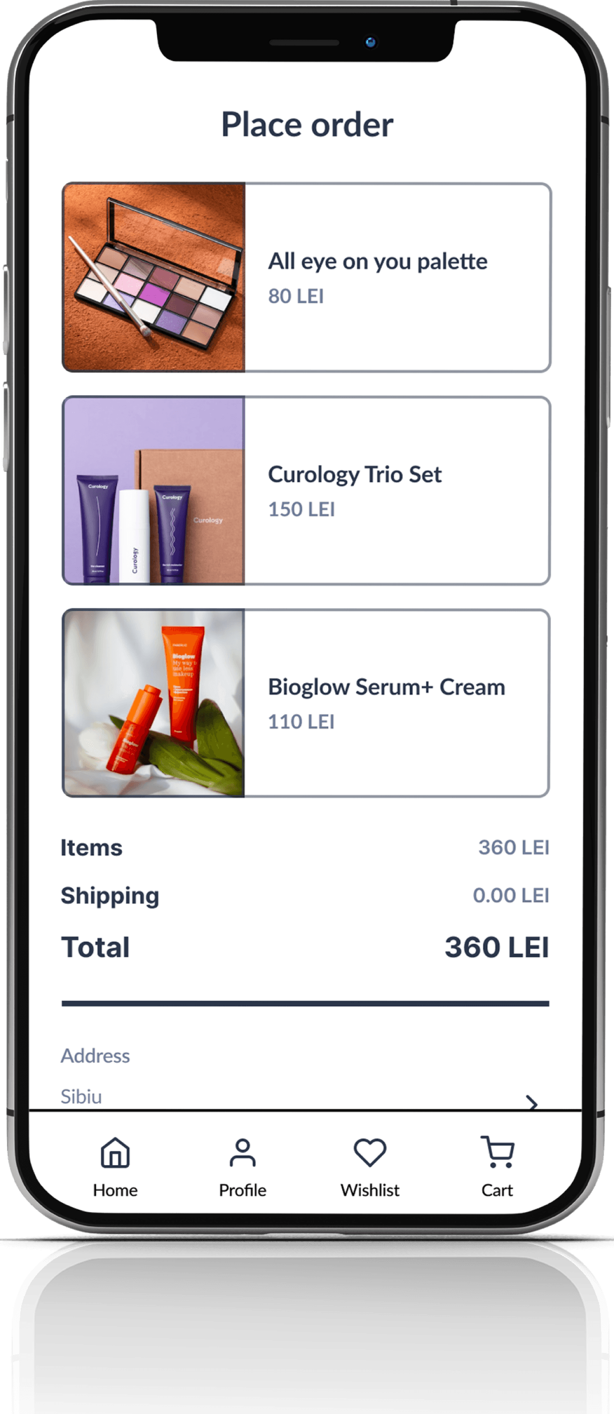
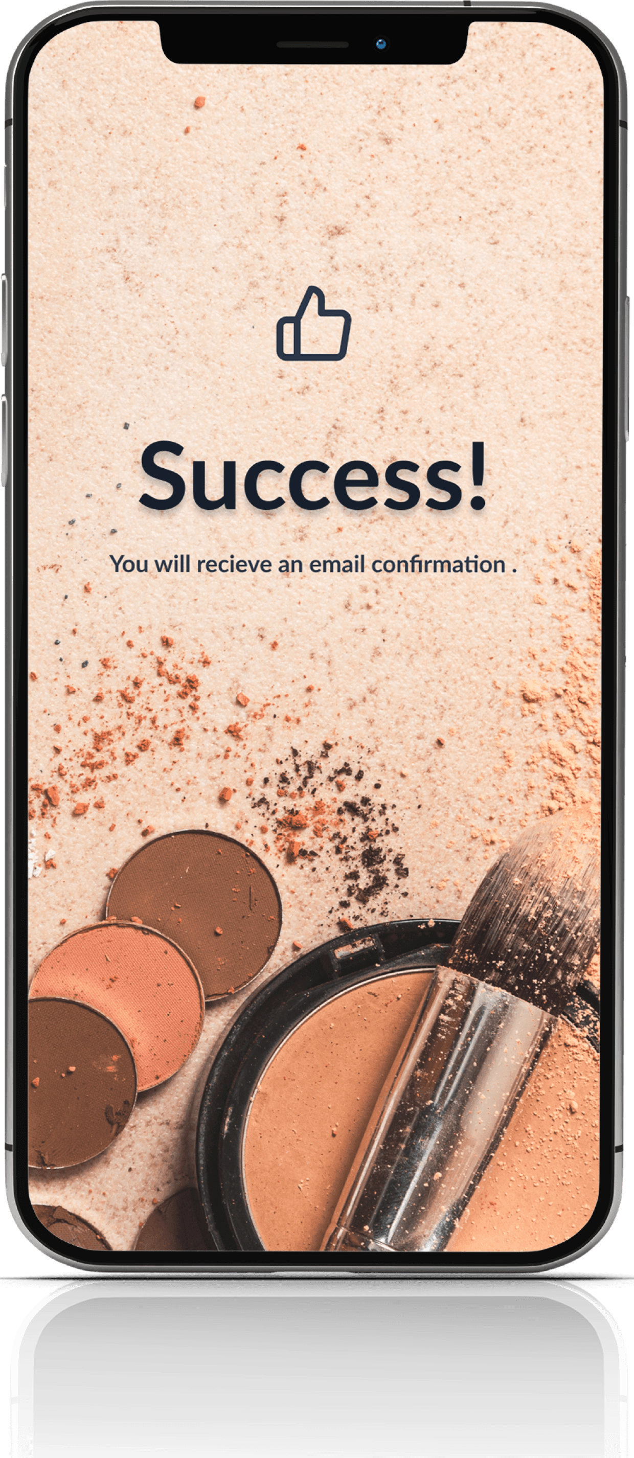
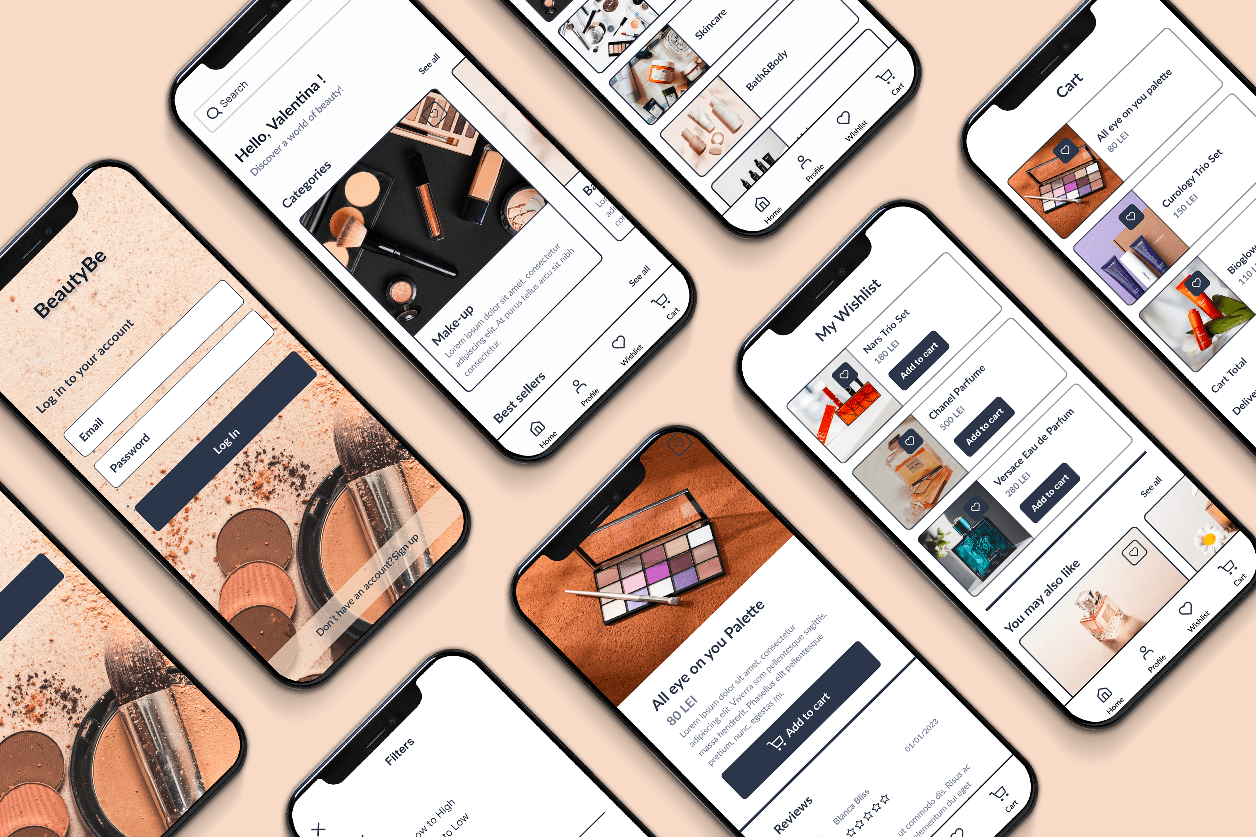
After several iterations, I have completed the high-fidelity screens for my makeup app design. Throughout the design process, my primary focus was to create a minimal and user-friendly interface that would be easy on the eyes. My design strategy centered around using clean lines, simple shapes, and neutral colors to ensure that the images and content would take center stage on the screens.
Overall, my design for the makeup app aimed to create a sleek and modern interface that would be intuitive and easy to use. By using a minimalist approach to design, I was able to keep the focus on the content and provide a seamless user experience.

